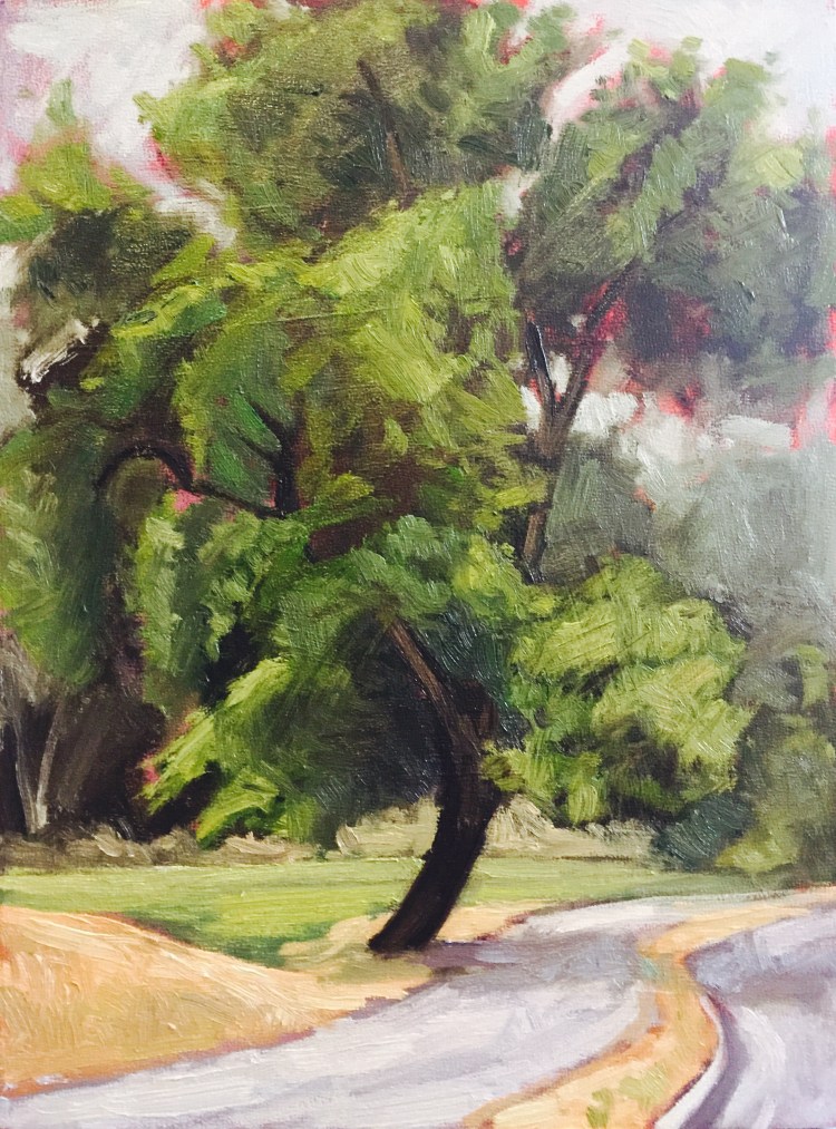
 I’ve decided that I need to slow down a little with my plein air paintings. I feel so rushed to produce a whole painting start to finish in one session, it’s a little overwhelming and I think my paintings look rushed. So I’m going to try to go back to the same location several times and allow the painting to progress more slowly, and try to develop some of the elements more. Here’s the start for today’s painting. I feel like this approach will take the pressure off some.
And I’m trying out a red underpainting.
I run by this tree every time I run down to the greenbelt. 🏃🏃🏃🏃

Also feels better 🙂
Sent from my iPhone
>
LikeLiked by 1 person
Reblogged this on All About Writing and more.
LikeLike
You got a great start. And I love the pink under painting too.
LikeLiked by 1 person
Thank you!!
LikeLike
Wow–cool touch with the red! And that tree has some great motion, a bit surreal, really.
LikeLiked by 1 person
Thank you! I like the red/pink underpainting too. It breaks up all the green.
LikeLiked by 1 person
gorgeous – the red underpainting works brilliantly
LikeLiked by 1 person
Thank you! I like it too.
LikeLiked by 1 person
Whatever you’re doing — keep doing it because your plein air series is really wonderful. A word of caution, though, about under-painting for oil paints. It can really make colors pop to use contrast, but because oil paint grows more transparent with time the long term effect of putting a complementary color in the ground can be to dull the color overall. I can tell you with experience that a wonderful orange ground I used on a landscape painting that I made in the mid-80s has made the foliage noticeably less intense now. An alternative would be to introduce red (or similar colors) in small quantities on the surface — like Pointillism — to get that intense contrast. Keeping the colors sitting side by side will give you the intensity without the dulling effect that comes — over time — from layers. It pertains to oil paints. I don’t think it’s true about acrylics — though I’m not sure. I have asked some conservators, but people I talked to were reluctant to make predictions about acrylics because they’re still “new media” — from the conservation perspective ….
LikeLike
Oh! I hadn’t considered that! Thank you for letting me know! I like the idea of adding in color as an accent. I’ll try that.
LikeLiked by 1 person