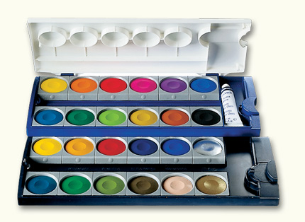
Ok watercolor artists, what do you recommend??? Watercolor paints that come in the little tubes or a set with a bunch of little dry squares or circles, like what we all used in elementary school, but you know, more professional and expensive? -Jill
Ok watercolor artists, what do you recommend??? Watercolor paints that come in the little tubes or a set with a bunch of little dry squares or circles, like what we all used in elementary school, but you know, more professional and expensive? -Jill
Comments are closed.

I’m not a watercolourist, but I go for pans- less fiddly
LikeLiked by 1 person
Seems like they’d be easier to use on the move, outside or something.
LikeLiked by 1 person
I love the tubes because I can get more intensity of color.
LikeLike
Thank you! Good to know.
LikeLike
Go with artist professional paints because the budget “student grade” are so insipid and not even close to the artist quality. I know that they are more expensive but well worth it. Also, I prefer tube paints because the colors are rich and bold that is if still wet. I try to put out only what I’ll use in a few sessions. I use a palette with the wells, I have never bought ready made palettes, so I have no idea about that.
LikeLike
Thanks! I’m off to get some.
LikeLiked by 1 person
I prefer the tubes as I get to choose my colors and the quality is much better. I have a set like in your photo which works fine for experiments but the quality is not very good. I use mainly Winsor and Newton professional grade watercolors in tubes. They are a bit expensive but they last a long time and you really only need your basic colors to start – yellow, red and blue and a black. I rarely use white. Hope this helps you! 😄
LikeLike
It does, a lot. I’m off now to get some. Thank you!!
LikeLiked by 1 person
I took your advice and got Cad Red, Cad Yellow, and Cobalt Blue, and Black. But I couldn’t stop myself from getting Burnt Sienna, Raw Umber, and U Blue. W&N pro grade in little tiny tubes. Thanks so much for your advice!
LikeLiked by 1 person
Thanks great, Jill! Yes, I have LOTS of other colors too. Hehe! Look forward to seeing your watercolor paintings. 😄🎨👍
LikeLike
I’m still relatively new at watercolours but I started off with tubes and then pans. I love pans for their portability (tip if you want more intense colours, use warm/hot water) but I still use the tubes to top up the pans when they run out… I honestly can’t say which are better though? (*ノωノ)
LikeLiked by 2 people
I like the tubes. The color is more saturated. 😀
LikeLike
As above – tubes are stronger – pans are more ‘handbag friendly’ – I use a very small range of colours (the same range as I do in oils) in a small tin that goes everywhere.
LikeLiked by 1 person
I’d add if the picture is good, it won’t matter what you use!
LikeLiked by 2 people
Thank you! I ended up getting the basic colors in tubes, and I bought my daughter a nice little set of pans, that I’m sure I will try out. Thank you! And I think you’re right, if the composition is good, one could get away with just using one wimpy color. Or Crayolas.
LikeLiked by 1 person
Yes, or a biro on the back of an envelope!
LikeLiked by 1 person
I have what you have in the picture. I didn’t want to spend a lot of money only to find out it’s not what I wanted to do
LikeLiked by 1 person
I almost walked away with nothing for exactly the same reason. Not sure it’s my thing.
LikeLiked by 1 person
Hi Jill! Watercolors are a lot of fun. I started with a little travel box of pan watercolors (maybe about 12 colors) and I have a set like the one you have posted above. Currently I use tubes. I think like with anything else, just give it a try. You can go inexpensive and upgrade if you feel that you like them. There is a Windsor & Newton Cotman Sketchers Pocket box set on Dick Blick. That might be a good place to start. 🙂 Have fun!!
LikeLiked by 1 person
Thanks!! I will check out the W&N Pocket set.
LikeLike
Hi Jill! I’m fairly new to watercolors too. I have a friend who told me that if ever I consider getting myself a set, get the artist grade instead of the student grade. Its a big investment but well worth it. So, I got myself a set of winsor and newton half pan palette of 24 and that has been the set I’m using for studies. The palette can fit 33 pans so I added empty pans and now I’m saving up for my additional 11 colors. Also, I agree with everyone, the palette is super handbag friendly.
LikeLiked by 1 person
Thank you Carrie! I ended up getting some pro grade W & N. Some colors I use all the time in oils. I will see what they do as oils. Should be fun and probably will make me feel a little nuts. The pans sound nice to me because you could easily take them out on location. Thanks again! I look forward to seeing more of your work.
XOXO Jill
LikeLiked by 2 people
You’re welcome Jill! I can’t wait to see what you come up with and read the stories behind them.
LikeLiked by 1 person
Hi Jill,
Apologies for missing you earlier. Hmm…pans or tubes? To some extent it does depend on the work you want to do. I have not met a pan that can stand up to professional-grade tube watercolors…though there is one that you’ll likely want to check out.
These are Prang pan watercolors, semi-moist. I’ve not used them much — but they’re nice to start out with. A few semesters ago when I was in my first Painting class, I got these, because I had used them as a kid and remembered they were nice (for that time). They’re also relatively inexpensive, and they are a combination of cheap + usable which a lot of people enjoy.
I can’t really recommend any other pan watercolors, though this is an area I haven’t greatly explored. They range from barely giving a tint to being intensely saturated (like that red-violet in the Prangs). The problem is that if you aren’t after bright, rainbow-hued colors…(I don’t think I’ve tried to mix the Prangs — I got them that long ago)…a set of student or scholastic-grade pans isn’t necessarily what you’ll want.
Right now I’m in my first Watercolor class. I’ve never used oils, but my Watercolor professor says that watercolors use most of the same pigments as are in oils…given that, the pigment codes on the tubes are of more use than the name of the color, when it comes to telling what is in there.
The post I’ll link here: https://encodey.wordpress.com/2016/02/05/completed-what-i-didnt-yesterday/ …goes over what I had before Spring semester started. The little piece of paper with the 12 swatches in the upper left corner of the first image, relates the Winsor & Newton Cotman pan watercolor set I got at the same time as the Prangs (someone at Blick gave me a deal). The 12 colors below that are the Cotman tube watercolor set which I had to have gotten sometime around 2009 — but they really don’t compare to professional-grade colors.
Most of the Cotmans in that set (that I would be using, anyway) are “Hues” — I’m not sure if this terminology is used in oils, but basically, they are approximations of the color of a more expensive and/or more hazardous pigment. Sometimes this is really disappointing: like when I got a Cobalt Blue Hue tube, only to find out that it was actually Ultramarine…granulation and all…and I was like, “If I wanted Ultramarine, I would have bought Ultramarine.” Thus began my foray into using the actual pigments which have known toxicity problems, as versus approximations which might be less-bad, but no one knows yet. 🙂
In any case (*cough*), I’m now using a palette of 10 W&N colors for class (I’ll list them below), the vast majority of which are Professional grade. There’s really not a comparison to the way these handle, as versus the way the Cotmans handle; the Cotmans are the student-grade version. The Cotmans are less highly pigmented and have more filler.
I’m thinking on this right now…trying to recall the paint brands which some other people I follow, use. I know Holbein is a very good brand, though up there in price (I’ve only used Holbein gouache, though — opaque watercolor). I’ve seen people who really like Daniel Smith colors online, though I’ve never used their products. I think one of my classmates has used Grumbacher paints — unless that was Sennelier — and he only uses Holbein and one other brand. His work, though, is really very graphic, like stuff that could be tattoos (with black waterproof ink work under transparent watercolor). I’m pretty sure it was Grumbacher.
I found some Grumbacher Academy paints lying around from at least seven years ago which had really nice hue and pigment density (well, yes…they were dried out!), but had to throw them out because the caps did not fit on the tubes anymore (the plastic degraded). The paints in these are still salvageable, if you cut the tube open and rehydrate them (my old Painting professor got a cache of free gouache this way), but I would have needed to store them somehow…I know empty tubes are sold, and I know that Japanese watercolors are often sold in chips to rehydrate, at least in Japan; I just didn’t want to do it.
All right: I’ve got to go soon, so I’ll list the colors I’ve got in W&N brand which my Prof had us get, and then check back later.
Warm Red (staining): Winsor (Naphthol) Red
Cool Red (nonstaining): Permanent Rose
Warm Blue (staining): Winsor (Phthalo) Blue (Green Shade)
Cool (?) Blue: Ultramarine (I’m never certain whether violet is a warm tone…)
Another Blue (nonstaining): Cobalt Blue
Warm Yellow (staining): Winsor Yellow (I think? hope?)
Cool Yellow (nonstaining): Aureolin (Cobalt Yellow)
Green: Viridian (Chrome Green)
Orange: Cadmium Orange
Black: Ivory Black
I’m also a big fan of Alizarin Crimson, which mixes with French Ultramarine…well, you probably know the drill!
I can clarify staining vs. nonstaining later, if you’re up for it. 🙂
LikeLiked by 1 person
Thank you so much, such great info. I don’t know the difference between staining and non staining but the colors/hues are similar to oils. I bought W & N professional quality tubes, the smallest they had, Cad Yellow, Cad Red Medium, Cobalt Blue, U-Blue, Burnt Sienna, Raw Umber, & Lamp black. I wasn’t sure about whether to get Lamp or Ivory, or the other black. So I went with lamp because i think it’s warm…we are always trying to remember what the blacks do. AND I bought a little set of pans for my daughter, that I can try out. I thought I’d start with just the basics for now. I know what these colors do in oils so I’ll see what they do in watercolors. I am positive I will add to them, thanks for your color suggestions. I use all of those in oils. I probably should have also gotten Yellow Ochre and Burnt Umber but it was all starting to add up and I was feeling crazy, and a little overwhelmed.
Thanks again for your great response. We will see what I can do with watercolors. XOXO Jill
LikeLiked by 1 person
DAAH! I just had a reply written out and then accidentally ran a search on this tab!
OK, well, I haven’t used Lamp Black…I don’t think…in watercolor. I could be wrong, and that’s the paint I used which my synthetic brush kept wiping up (leading me to hate using that brush — at the time). If I did use it, I no longer use it. I’ll check my archives.
I’ve used Ivory and Mars Black before, though the most memorable instance of this was with acrylics. Mars Black has a bluish overtone. Ivory Black has a brownish overtone. Mars is probably going to overpower any mixture easily, as it has a lot of tinting strength. Ivory is much easier to handle in this regard, because it has much less tinting strength.
The difference between staining and nonstaining colors is that nonstaining colors can be scrubbed with a damp brush, then blotted with a paper towel or rag, and the color will come up. (This saved my butt on my last still-life assignment.) Staining colors do not come out of the paper all the way.
Do you know about how to keep your watercolor paper from warping?
And, curious: does Ultramarine granulate in oils? (If not, you’ll see what I mean by “granulate” when you try painting out a wash of Ultramarine in watercolor!)
LikeLiked by 1 person
I’m starting to think watercolors are less straight forward than oils. Which is fine and will be a fun challenge to figure out. Ultramarine doesn’t granulate in oils.
LikeLike
Yes, I was using Lamp Black. Here:
https://encodey.wordpress.com/2015/02/09/drawing-for-preliminary-watercolor-and-prioritizing-time/
The next two entries after that, show what I used it on (I really didn’t know what I was doing, at the time). I was having trouble with my synthetic brush chattering across the page and picking up color from the page in my preliminary work (the value scale and practice, before this).
I can’t recall if I used my Sumi-e brushes (Yasutomo, Mao) on the work in the latter two entries…but they did work better with the watercolor than the synthetics, because they were softer (and not plastic). I don’t think that’s an intended use, though (as versus ink drawing and calligraphy).
Still makes me want to get natural hair, though…
LikeLiked by 1 person
Tubes all the way!!!!!
LikeLiked by 1 person
Got it, done.
LikeLiked by 1 person
Golden’s Qor watercolors will knock your socks off with their intensity. They don’t mold in the palette. Just try ’em.
LikeLiked by 1 person
though pans are more convenient, the quality of paint that tubes give are way richer 🙂
LikeLiked by 1 person
Thank you!!!
LikeLike